Building a Place with Repeated Tiles
A small tile set can make a game world feel like somewhere, not a patchwork. The trick is to give repeated pieces a clear visual grammar and let their arrangement carry the story.
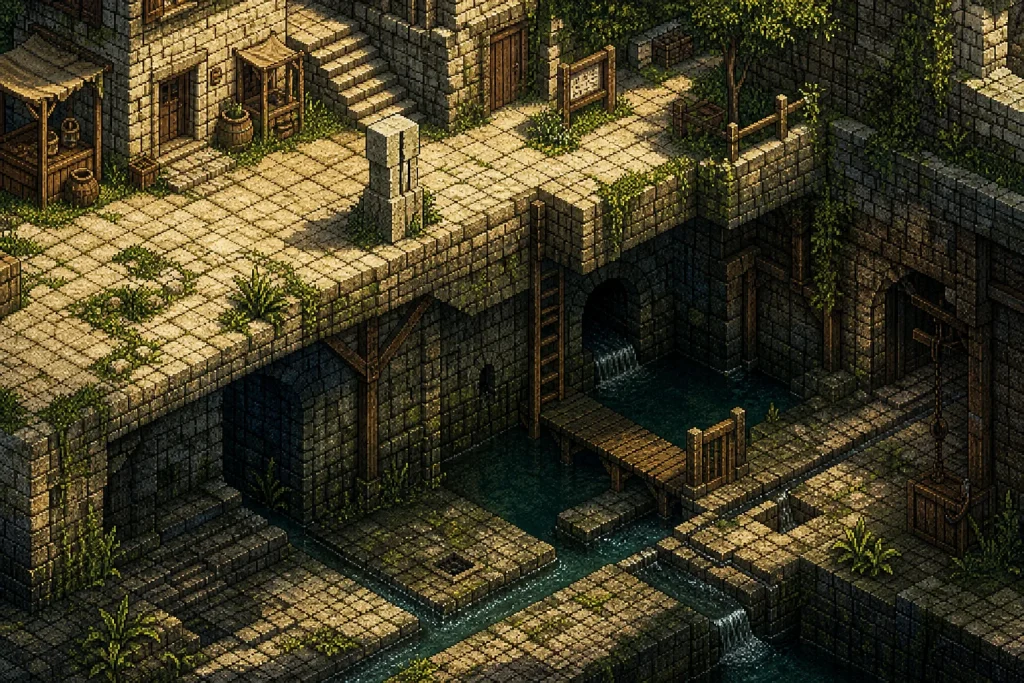
The common mistake is to repeat a useful tile wherever it fits, then expect the player to read the result as a place. A stone floor appears in a corridor, a hall and a cellar; the graphics are consistent, but the world feels like one room copied into another. The cost is more than visual sameness: players lose the small clues that tell them where they are and why one space differs from the next.
That problem suits a deliberately modest design exercise. Imagine a maker building a short, fictional adventure called The Bell Below for a home computer with a limited palette. The setting is an old hilltop settlement and the underground cistern beneath it. The maker has a compact set of square tiles: pale limestone, dark damp stone, timber, a few plant forms, water, and a handful of architectural details. The aim is not to disguise the limited set. It is to make repeated pieces feel as though they belong to one connected place.
Begin with a material that has a reason to repeat
The maker starts with limestone because it can plausibly appear in the settlement’s streets, retaining walls and older buildings. That decision gives the world a visual anchor. But a material alone cannot explain every location. A pale block in an open lane and the same block under a dripping cistern may share a source while telling different stories.
So the maker assigns each material a job. Limestone marks built edges and public routes. Timber suggests repairs, doors and structures added later. Dark stone indicates dampness, depth or a surface kept out of the sun. Greenery appears where soil can gather or water can reach. Water is not simply a blue floor tile; it marks a low point and helps the player read the cistern’s shape.
This is a useful distinction: a recurring element becomes coherent when it carries a stable meaning, not merely when it keeps the same colour. If the dark stone is used as a shadow in one area, a cave wall in another and a decorative border elsewhere, it becomes harder to interpret. The maker can still use it flexibly, but each use should preserve a relationship the player can recognise.
Build a visual grammar before filling rooms
Next comes a small grammar for arranging the tiles. The maker decides that limestone blocks form long, mostly straight boundaries; timber interrupts those boundaries at entrances and repair points; dark stone gathers below ledges and around water; and plants emerge from cracks rather than sitting as isolated decoration. These rules are not laws of nature. They are habits the game teaches through repetition.
At this stage, a tile sheet can be treated like a box of building materials rather than a finished world. The maker sketches a few simple arrangements on graph paper or in a tile editor such as Tiled. A wall has a top edge, a middle run and a corner. A path has a centre and a border. A water channel has a bank that can turn without looking like a broken seam. Each variation should solve a visible problem: how a wall ends, how a doorway sits in it, or how the ground changes near a slope.
Keeping a small set of transition pieces matters more than making every stone unique. A corner tile can make two walls meet convincingly. A broken edge can signal that a boundary has fallen away. A strip of damp stone can connect dry masonry to water. These pieces help the player infer the shape behind the visible surface, which is what makes a tiled scene feel constructed rather than assembled from squares.
Let the same tiles change meaning through arrangement
The settlement and cistern now share limestone, but they do not share the same composition. In the upper streets, pale stone appears in open stretches with timber doors and occasional weeds at the edge. The repeated wall tile is interrupted often, leaving room for signs of work and daily use. Below ground, limestone forms more continuous walls; dark stone gathers in corners, and the water line cuts across the player’s view. The basic materials remain familiar while their relationships change.
That contrast gives repetition a purpose. The player can recognise the same stone and also notice that the place has become enclosed, wetter and older. A world does not need a wholly new palette each time the scenery changes. It needs enough variation in spacing, adjacency and silhouette to make the old material say something new.
Imagine the maker first lays the cistern floor with the same broad limestone pattern used in the street. The room looks like an indoor version of the lane, so the maker shifts the dark stone to the lower wall edges, breaks the floor pattern with a narrow channel, and places timber only where a walkway has been repaired. The expected visible result is a room that still belongs to the settlement but reads as a damp utility space. The adjustment comes from tile relationships, not from adding an entirely new set of art.
Use landmarks to give repetition a memory
Even a clear material grammar can become monotonous if every room uses the same arrangement. The maker gives the player a few landmarks that recur with changes: a split limestone pillar, a timber brace with a missing peg, and a distinctive cluster of weeds near a drain. These details are easy to spot, but they are not scattered at random. Each has a reason to appear in a particular part of the settlement.
A landmark works best when it is specific enough to be remembered and modest enough not to overwhelm the scene. In a small game, a single unusual tile may be more useful than a large illustration. The split pillar might appear first beside the market steps and later as a fragment in the cistern, helping the player understand that the underground structure lies beneath that part of town. The repeated object links spaces across a route.
There is a practical limit. If every distinctive detail recurs everywhere, it stops distinguishing anything. The maker keeps ordinary limestone common and reserves the split pillar for places where the map needs a spatial clue. This creates a gentle visual memory: the player does not need a map label to recognise the area, because a familiar shape has returned in a changed context.
Make variation follow wear, repair and use
Repeated tiles can also suggest time. The maker decides that exposed edges are chipped, sheltered walls stay cleaner, and timber repairs are visibly different from the stonework around them. These details are not random noise. They describe how the settlement has been used.
For instance, the entrance to the cistern has a smooth limestone threshold, polished by passage, while the wall beside it is darkened near the water. A newer timber brace sits across an older stone opening. The player can read the scene as a place maintained by people, even though the art uses a limited number of pieces. Small differences in wear create history without requiring a long explanation.
Variation should also respect the game’s viewpoint and scale. A tiny mark that cannot be distinguished from the surrounding pixels is unlikely to help. A strong change in edge, shade or silhouette will read more clearly. The maker checks each decoration at the size it will appear during play, not only enlarged in the editor. If a crack looks like an accidental line or a plant obscures the edge of a doorway, the tile is simplified or moved.
Check whether the player can read the place
Before adding more scenery, the maker walks through the fictional map and asks practical questions. Can the player tell where a wall ends? Does the water read as a low channel rather than another floor texture? Can the entrance to the cistern be found without making every doorway identical? Do recurring details clarify the route, or merely decorate it?
A plain room is useful here. The maker temporarily removes plants, cracks and small props, leaving the major stone boundaries and water. If the room’s structure is unclear without decoration, more decorative tiles will not solve the problem. The underlying shapes need to communicate first. After that, a few signs of wear can make the place feel inhabited.
Another helpful check is to compare tiles in their neighbours, not in isolation. A pale wall tile may look clear on a tile sheet but merge with the floor once placed beside it. A dark corner may seem distinctive alone yet turn into a distracting blot when repeated along an entire corridor. The maker adjusts the transitions and spacing until the eye can follow the room’s edges without mistaking every difference for a new object.
Let constraints become the world’s character
By the end of the imagined walk-through, the maker has not expanded the tile set very much. The change is in how the pieces are organised. Limestone establishes continuity; timber records repair; damp stone and water explain the underground spaces; and a few landmarks make the route memorable. The settlement feels connected because repeated pieces have consistent roles, while their arrangement reflects different conditions.
The broader lesson is that a small tile set asks for decisions, not concealment. Repetition becomes a visual language when the player can learn what materials tend to mean, recognise deliberate exceptions, and use recurring shapes to understand space. A useful test for each tile is simple: does it define a boundary, show a material change, indicate use, or help the player remember a location? If it does none of those things, it may be decoration the scene does not need.
When a new room feels too much like an old one, the first fix need not be another batch of art. Change what the existing pieces touch, where they gather, and what kind of wear they carry. A narrow channel, a repaired doorway or a familiar pillar in an unexpected setting can give repeated tiles a new purpose—and make a limited world feel larger than its parts.